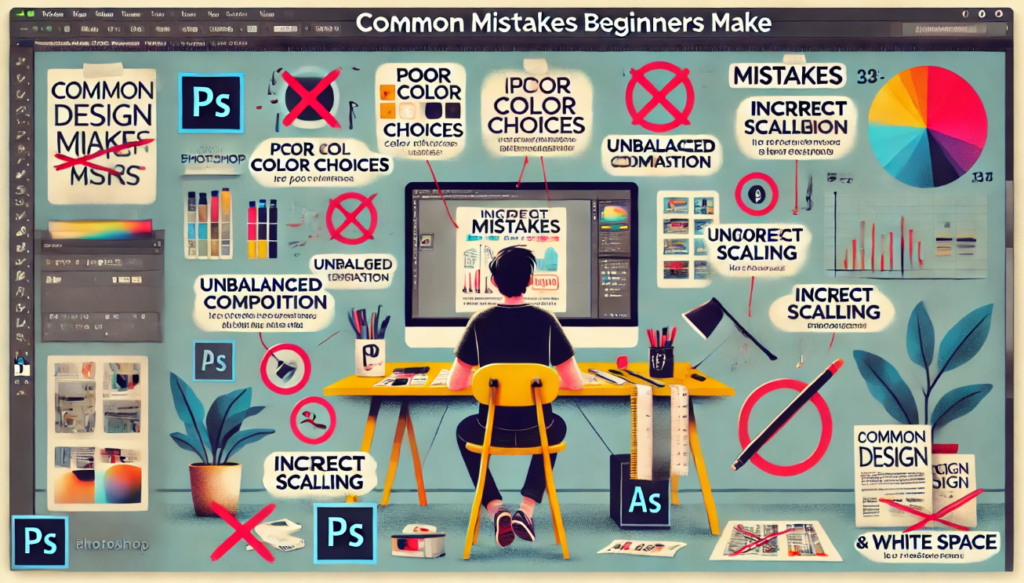
Designing can be fun and artistic, but it can also be hard, especially for new designers. When making a brand, website, or ad, pay close attention to the little things. This is a simple mistake you can avoid when you are making something. Someone else will be able to understand and use your work with no trouble. This book talks about a lot of the mistakes people make when they first start.
Hey there, my name is Anim, and I’m an artist who has worked with UI/UX design, video editing, and graphics design for a long time. I’ve had the chance to work with both well-known companies and skilled solo artists since I became a professional in 2016. I’m always interested in new techniques and trends because I love design so much. This helps me do new and important work.
I’ve improved at making designs that are both nice to look at and useful for people, so they get the point across and keep people interested. Many projects on my resume show that I can do good work in many different areas of design. Based on what I’ve learned and done at work, I can’t wait to share useful ideas, tips, and cool hacks with you all. With this, Young artists will be more creative and reach their full potential.
Here at DesignsDabble, our goal is to “Empower Beginners by Igniting Creativity.” To start, you need to learn, get the right tools, and get help. This is something that many people do wrong when they first start making things. No need to worry about them now that you know these tips. You can make patterns that look great and work well instead.
1. Having way too many fonts
Some fonts may not look good, but it’s important to use the right ones. To make things look good and be easy to read, only use two or three styles that go well together. Taglines should use bold fonts, and the main text should use simple fonts. This will help you understand how the words are put together.
For brand names, you should use strong, easy-to-read fonts like Helvetica. For body writing, use a clean style that is easy to read, like Arial. The style of the art stays the same, and this mix makes everything clear.
2. It’s not clear what the order is.
So that people can use your design, make sure that everything you’ve put together makes sense. To make the parts stand out, you can move them around, change their size, or give them different colors. Putting things in the right order makes it easy for people to understand what you mean.
Use different-colored lines to show what’s most important at the top of the page. It will stand out more this way. White and small shapes work better for things that aren’t very important.
3. Making use of too many icons
Adding icons can improve the look of a design, but too many can make it look crowded. Make it clear when you need to show someone how to do something or explain something. Check that every button looks and works the same.
One way to show an email address is with a letter icon. But don’t add extra icons that don’t go with the style or help the message in any way.
4. Using way too many stock photos
They can help, but if you use too many of them, your design might look too simple. You can improve photos for free. Do not use them too much.
Before you use a picture, you need to change it. You can crop it, change the colors, or add layers to make it fit with the rest of your design.
5. Choosing the Wrong Colour Scheme
Pick a color that looks good and is easy to read. Choose colors that go with your project’s style and goals. To see how colors go together, learn about color theory. Make sure your idea can be used by anyone.
Use soft colors like blues and greys on your business website to make it look professional. On an event flyer, use bright colors that don’t go together to show energy and get people’s attention.
6. Don’t look
It might not look good if you write something wrong. When you’re done, read it again to make sure the style, spelling, and writing are correct. Having someone else look over your work can help you understand it better and find mistakes you might not have seen yourself.
There are many tools you can use to check your writing and words. You can also find strange words or mistakes by reading your work out loud.
7. Fonts that don’t go well together
If you mix styles that don’t go well together, it might not look good. Choose fonts that look good together in terms of style and weight. If you use both a new sans-serif style and a classic type, your work will look better.
To find styles that go well with each other, use a tool that does that. Serif fonts, like Times New Roman, and sans-serif fonts, like Arial, can look great next to each other.
8. Writing Background
The writing in the background shouldn’t be too little or too close. The words must be big enough to read and stand out. Your design needs to be able to be read on many devices and in all kinds of light.
When you make something for the web, the background color and the word color should be very different. The font size for body text should be at least 16px.
9. Putting things in the wrong order and calling them different names
Name all of your files the same thing to keep them in order. You can get things done quickly and reach your goals if you plan. Place things and name them in a way that helps you understand what they are.
Sort files into groups based on the job type or the name of the client. Name the files in a way that makes sense, like “Client_ProjectName_Version1.” This can help you find things faster when you need them.
10. Making the wrong choice
Plans don’t look good with bad pictures. Get your work at least 300 dpi. Pics that are too small for digital work shouldn’t be used. Check to see if the spot can handle the extra space.
Make sure that all the names and pictures are at least 300 dpi when you print something. Website pictures should load quickly and look good.
11. Putting things off
When things are put off, plans are made quickly and not well. Plan and give yourself due dates that make sense. Break up your work into manageable steps to stay on track and get it done.
Some tools can help you keep track of things and remember when they need to be done. Break up big tasks into smaller ones to finish them faster and with less stress.
12. Not Being Able to Wait
You need time and skill to make things. Don’t forget that getting better at things when you’re mad takes time. Do little things and ask for help when you need it.
Let’s say you want to learn a new way to draw. Start with easy lessons and get better at them as you go. Don’t be afraid to get help from professional artists or to learn online.
13. What not to do when you have nothing to put
You can also call white space a blank space or space. It moves parts of a planning room around. The important things will stand out because it won’t look too busy. There should be room between the parts of your plan.
Signs should have a lot of room between the words and the picture. Leave some space between the pieces. They’ll be able to read better.
14. Making it hard for people to use things
Let other people use your work by sharing it. For each picture, use a different set of words, bright colors, and easy-to-read styles. Check to see if your idea can be used with computer programs.
See how well WAVE users can handle your site. For screen reader users, make sure that all of the pictures have alt text and that the ratio of text to background is WCAG-compliant.
15. Alignment That Isn’t Always Right
When plans are matched, it looks like they were put together and thought out ahead of time. Use a grid to line things up in a straight line. Layouts that don’t change make it easier for the eye to see.
Use lines and alignment tools to plan your projects and make sure everything goes where it should. The picture needs to be in the middle or lined up with the other pieces. The words should also line up with the main line.
16. Leaving space:
To get the right mix, you need to leave enough empty room. Each page shouldn’t have too many words and pictures. You can read your work better and focus on the important parts if you leave gaps in it.
It can look better if you leave space between the words and pictures on a flyer. Not getting lost, people will be able to keep their attention on the important things.
Summary
Even though artists make mistakes a lot, they can still enjoy and be proud of their work. Don’t do these things. Other people might find them useful and easy to use. Don’t do these wrong things; instead, do what was said.
Remember that making things is a way to learn all the time. Don’t give up, and always be ready to try something new. Draw a lot and work hard. You’ll get better. Thanks for reading this DesignsDabble help. We hope it makes you think of new things. Do not give up! You’ll soon be able to make beautiful pictures!

